Welcome to the jungle of digital marketing, where every pixel plays a role in creating a harmonious ecosystem.
Your website stands as your base camp.
Amidst the foliage, an often underestimated ally emerges....
The pop-up message, a crucial guide in this vast terrain.
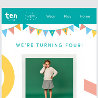
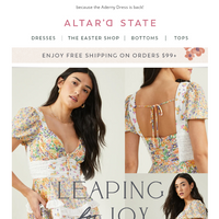
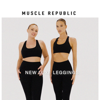
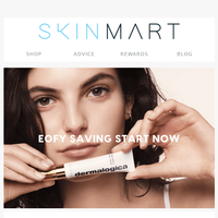
Website pop-up messages can be the key to effectively grabbing your prospects' attention and driving them toward meaningful action.
But creating the perfect pop-up message can be more complex than it seems—It's requires delicate balance between capturing attention without being intrusive, providing value without overwhelming, and compelling the reader to act without appearing pushy.
Join us as we explore the dance of creating the perfect website pop-up message that captures attention and compels action.
Save the date!
We’ve got another can’t-miss event on the horizon for ya’ll!
Join us on Tuesday, March 26th at 11:00 am PT for ourMaximizing eCommerce ROI: Advanced Strategies for Email Deliverability, Compliance & Segmentationft. Larry Kim, Founder & CEO of Customers.ai and Jimmy Kim, Founder & CIO of Sendlane.
They’ll be diving into how to:
👉
Optimize deliverability and sender reputation
👉
Master website visitor identification
👉
Navigate privacy and legality challenges
👉
Stay current with the latest Google/Yahoo updates
Register for free here.
Now, whether you're new to the digital marketing space or a seasoned professional looking to brush up on your skills, today’s guide has something for everyone.
So let’s get to it. 👇
How to Create the Perfect Pop-Up: Step-by-Step

Pop-ups 101
Pop-upswork by triggering a small window or a box to appear on a webpage based on specific pre-set rules or triggers. They offer great flexibility, allowing you to customize when and how they appear based on specific situations (aka rules or triggers).
Here's a closer look at some scenarios that can help determine your pop-up strategy:
➡️
Exit intent pop-ups: Designed to engage visitors right when they are about to leave your website as a final pitch to hold their attention, often offering them something valuable that might change their mind about leaving.
➡️
Time delay or timed pop-ups: This pop-up is triggered if a visitor has been on the same page for two minutes without taking any action, a timely pop-up might just be the nudge they need to make a move.
➡️
Scroll-point: Here, the pop-up is configured to appear once a visitor has scrolled past a specific percentage of the page and is a great way to recapture attention once initial interest has been established.
➡️
On-click: This type of pop-up appears when a user clicks a specific button or link on a page, usually offering additional information without cluttering the main page content.
Once triggered, the pop-up momentarily takes over the user's screen, presenting a message—acting as a direct line communication with your users and providing an opportunity to guide them toward a desired action.
Pop-ups must be thoughtfully designed and strategically implemented to ensure they effectively engage your audience without disrupting their browsing experience.
7 Steps to Create High-Converting Pop-up Messages
Creating awebsite pop-up message is part science, part art. Let’s get into the steps to creating effective, attention-grabbing pop-up messages that align with your brand and drive conversions.
1. Choose a pop-up platform builder
Before you can start designing your pop-up, you'll need a platform builder to create and implement it.
Sendlane offers a user-friendly interface, integrated email, SMS, reviews, and forms with numerous customization options to create different forms like pop-ups. When choosing a builder, consider its integration capabilities with your existing website and CRM, customization options, and analytics tools.
2. Craft your pop-up to reflect your branding
Once you've picked a builder, the next step is to decide what your first pop-up will look like and what it will say. This is where your creativity comes into play.
Your pop-up messages aren't standalone elements —they're a part of your overall website. It's imperative to select fonts, images, and other elements that align your pop-up features with those on your website to create a cohesive brand experience.
🎨
Color and branding: The design of your pop-up should align with your brand's color scheme and overall aesthetic. Consistency in branding helps build recognition and trust—so choose colors that pop, but ensure they complement your overall website design.
💁♀️
Tone and style: Your pop-up's tone and style should reflect your brand personality. Whether your brand voice is formal, friendly, or quirky, ensure it's consistently reflected in your pop-up's language and presentation.
3. Keep it simple
The text in yourpop-upsshould be clear, concise, and compelling.
Keep your message short and to the point, focusing on the benefits your user will gain by taking the desired action. Avoid jargon and ensure your copy is easy to understand for all visitors.
The saying "less is more" couldn't be more apt for pop-ups. Remember, you have a brief window to attract attention and ignite interest. Keep your design and message concise, and relentlessly evaluate every word and element in your pop-up for its necessity.
4. Define a goal for your pop-up
Every pop-up should serve a specific purpose: increasing newsletter subscriptions, promoting a sale, or collecting user feedback.
Defining this goal will help you create a focused, relevant message that drives users toward the desired action.
5. Create an attractive Call-to-Action (CTA)
Your CTA is arguably the most crucial part of your pop-up. It should be visually striking and clearly instruct the user on what action to take.
Your pop-up needs to stand out while still aligning with your brand. Ensure your headline and CTA contrast with the rest of the pop-up. Larger font sizes and vibrant colors can draw attention to the core value of your message.
Use action-oriented language and make sure it's evident what the user will receive in return.
6. Be transparent
Transparency is key to building trust with your visitors. If you're collecting email addresses, let your users know how you'll use their data.
If you're promoting a discount or offer, ensure all terms and conditions are clear. Transparency fosters trust and ensures your visitors are more likely to engage with your brand in the future.
7. Optimize for mobile
With the majority of traffic coming from mobile devices, it's essential to make your pop-ups mobile-friendly. Keep your copy brief, make your pop-ups easy to interact with, and limit the number of form fields. Full-screen mobile pop-ups that are Google-friendly are often the most effective.
Remember, creating an effective pop-up is an art that combines your brand personality with proven design principles. Each of these different pop-ups and best practices is geared to ensure your pop-up messages resonate with your audience and help drive conversions.
When to use pop-up messages?
Knowing when to usepop-upscan significantly impact their effectiveness. While there isn't a one-size-fits-all answer, here are a few situations where pop-ups can come in handy:
Visitor Exit Intent
If a visitor is about to leave your site without engaging, a well-timed pop-up can persuade them to stay or provide their contact information for future engagement.

Offering Discounts or Special Promotions
Limited-time offers, or exclusive discounts can be effectively promoted via pop-ups, creating a sense of urgency that can drive conversions.

Collecting Email Subscriptions and or SMS consent
A pop-up that appears when a visitor is engaged with your content can effectively invite them to subscribe to your newsletter or updates, which is a helpful tool in generating leads.

Measuring pop-up messages
Like any marketing tool, the success of pop-up messages should be measured and analyzed.
Better understand visitor behavior using these metrics:
Conversion rate
The conversion rate of apop-upis the percentage of visitors who complete the desired action on your pop-up, like submitting an email address or redeeming a coupon. A high conversion rate generally indicates that your pop-up is compelling and effectively encourages users to take action.
% of pop-up windows close
This metric refers to the percentage of visitors who close the pop-up without engaging with it. A high rate might indicate that your pop-up is not engaging, is annoying to users, or is appearing at the wrong time.
Time or duration of pop-up
The amount of time a pop-up is open on a user's screen can provide insights into its effectiveness. If users typically close the pop-up immediately, it might not be engaging enough, or it may be seen as intrusive.
Drop-off rate
This measures the number of users who leave your site after seeing thepop-up. If this rate is high, your pop-up may be negatively affecting the user experience.
How to analyze data to optimize pop-up messages
Analyzing your pop-up's performance data is key to making improvements. Look for trends in your metrics—are there particular times when your pop-up is more successful? Is there a correlation between the design or content and conversion rates? Use this analysis to refine your pop-up's design, timing, and content.
Test different variants of your pop-up with A/B testing to see what works best. A different CTA may generate leads, a higher conversion rate, or a different design is less likely to be immediately closed.
Remember, optimizing your pop-ups is an ongoing process. As you continue to make improvements, you can create more effective pop-ups that optimize user experience and align with overarching business goals.
Making the most of your website pop-up messages
Pop-up messagescan be a powerful tool in your B2B marketing toolkit. They can grab attention, guide user action, and ultimately contribute to your overall business goals. But as with any tool, they require strategic planning, creative execution, and continual optimization to deliver results.
Whether you're new to pop-up marketing or looking to refine your approach, keep these principles in mind. Tailor your messages to your audience, align your pop-ups with your brand, and ensure they provide real value to your visitors. Measure their performance regularly and use the insights to optimize your strategy.
And remember, you don't have to do it alone. Sendlane is here to help, providing a user-friendly forms builder and robust analytics to guide your efforts.
Thanks for joining us for this weeks DTC Rundown!
As always, share with a friend of colleague who might enjoy todays content.
See ya next time! 👋
|
NL Your step-by-step guide to perfect pop-up messages͏ ͏ ͏ ͏ ͏ ͏ ͏ ͏ ͏ ͏ ͏ ͏ ͏ ͏ ͏ ͏ ͏ ͏ ͏ ͏ ͏ ͏ ͏ ͏ ͏ ͏ ͏ ͏ ͏ ͏ ͏ ͏ ͏ ͏ ͏ ͏ ͏ ͏ ͏ ͏ ͏ ͏ ͏ ͏ ͏ ͏ ͏ ͏ ͏ ͏ ͏ ͏ ͏ ͏ ͏ ͏ ͏ ͏ ͏ ͏ ͏ ͏ ͏ ͏ ͏ ͏ ͏ ͏ ͏ ͏ ͏ ͏ ͏ ͏ ͏ ͏ ͏ ͏ ͏ ͏ ͏ ͏ ͏ ͏ ͏ ͏ ͏ ͏ ͏ ͏ ͏ ͏ ͏ ͏ ͏ ͏ ͏ ͏ ͏ ͏ ͏ ͏ ͏ ͏ ͏ ͏ ͏ ͏ ͏ ͏ ͏ ͏ ͏ ͏ ͏ ͏ ͏ ͏ ͏ ͏ ͏ ͏ ͏ ͏ ͏ ͏ ͏ ͏ ͏ ͏ ͏ ͏ ͏ ͏ ͏ ͏ ͏ ͏ ͏ ͏ ͏ ͏ ͏ ͏ ͏ ͏ ͏ ͏ ͏ ͏ Welcome to the jungle of digital marketing, where every pixel plays a role in creating a harmonious ecosystem.Your website stands as your base camp.Amidst the foliage, an often underestimated ally emerges....The pop-up message, a crucial guide in this vast terrain.Website pop-up messages can be the key to effectively grabbing your prospects' attention and driving them toward meaningful action.But creating the perfect pop-up message can be more complex than it seems—It's requires delicate balance between capturing attention without being intrusive, providing value without overwhelming, and compelling the reader to act without appearing pushy.Join us as we explore the dance of creating the perfect website pop-up message that captures attention and compels action. Save the date!We’ve got another can’t-miss event on the horizon for ya’ll!Join us on Tuesday, March 26th at 11:00 am PT for ourMaximizing eCommerce ROI: Advanced Strategies for Email Deliverability, Compliance & Segmentationft. Larry Kim, Founder & CEO of Customers.ai and Jimmy Kim, Founder & CIO of Sendlane.They’ll be diving into how to: 👉Optimize deliverability and sender reputation👉Master website visitor identification👉Navigate privacy and legality challenges👉Stay current with the latest Google/Yahoo updates Register for free here.Now, whether you're new to the digital marketing space or a seasoned professional looking to brush up on your skills, today’s guide has something for everyone.So let’s get to it. 👇 How to Create the Perfect Pop-Up: Step-by-Step Pop-ups 101Pop-upswork by triggering a small window or a box to appear on a webpage based on specific pre-set rules or triggers. They offer great flexibility, allowing you to customize when and how they appear based on specific situations (aka rules or triggers).Here's a closer look at some scenarios that can help determine your pop-up strategy:➡️Exit intent pop-ups: Designed to engage visitors right when they are about to leave your website as a final pitch to hold their attention, often offering them something valuable that might change their mind about leaving.➡️Time delay or timed pop-ups: This pop-up is triggered if a visitor has been on the same page for two minutes without taking any action, a timely pop-up might just be the nudge they need to make a move.➡️Scroll-point: Here, the pop-up is configured to appear once a visitor has scrolled past a specific percentage of the page and is a great way to recapture attention once initial interest has been established.➡️On-click: This type of pop-up appears when a user clicks a specific button or link on a page, usually offering additional information without cluttering the main page content. Once triggered, the pop-up momentarily takes over the user's screen, presenting a message—acting as a direct line communication with your users and providing an opportunity to guide them toward a desired action.Pop-ups must be thoughtfully designed and strategically implemented to ensure they effectively engage your audience without disrupting their browsing experience. 7 Steps to Create High-Converting Pop-up MessagesCreating awebsite pop-up message is part science, part art. Let’s get into the steps to creating effective, attention-grabbing pop-up messages that align with your brand and drive conversions.1. Choose a pop-up platform builderBefore you can start designing your pop-up, you'll need a platform builder to create and implement it.Sendlane offers a user-friendly interface, integrated email, SMS, reviews, and forms with numerous customization options to create different forms like pop-ups. When choosing a builder, consider its integration capabilities with your existing website and CRM, customization options, and analytics tools.2. Craft your pop-up to reflect your brandingOnce you've picked a builder, the next step is to decide what your first pop-up will look like and what it will say. This is where your creativity comes into play.Your pop-up messages aren't standalone elements —they're a part of your overall website. It's imperative to select fonts, images, and other elements that align your pop-up features with those on your website to create a cohesive brand experience. 🎨Color and branding: The design of your pop-up should align with your brand's color scheme and overall aesthetic. Consistency in branding helps build recognition and trust—so choose colors that pop, but ensure they complement your overall website design.💁♀️Tone and style: Your pop-up's tone and style should reflect your brand personality. Whether your brand voice is formal, friendly, or quirky, ensure it's consistently reflected in your pop-up's language and presentation.3. Keep it simpleThe text in yourpop-upsshould be clear, concise, and compelling.Keep your message short and to the point, focusing on the benefits your user will gain by taking the desired action. Avoid jargon and ensure your copy is easy to understand for all visitors.The saying "less is more" couldn't be more apt for pop-ups. Remember, you have a brief window to attract attention and ignite interest. Keep your design and message concise, and relentlessly evaluate every word and element in your pop-up for its necessity.4. Define a goal for your pop-upEvery pop-up should serve a specific purpose: increasing newsletter subscriptions, promoting a sale, or collecting user feedback.Defining this goal will help you create a focused, relevant message that drives users toward the desired action.5. Create an attractive Call-to-Action (CTA)Your CTA is arguably the most crucial part of your pop-up. It should be visually striking and clearly instruct the user on what action to take.Your pop-up needs to stand out while still aligning with your brand. Ensure your headline and CTA contrast with the rest of the pop-up. Larger font sizes and vibrant colors can draw attention to the core value of your message.Use action-oriented language and make sure it's evident what the user will receive in return.6. Be transparentTransparency is key to building trust with your visitors. If you're collecting email addresses, let your users know how you'll use their data.If you're promoting a discount or offer, ensure all terms and conditions are clear. Transparency fosters trust and ensures your visitors are more likely to engage with your brand in the future.7. Optimize for mobileWith the majority of traffic coming from mobile devices, it's essential to make your pop-ups mobile-friendly. Keep your copy brief, make your pop-ups easy to interact with, and limit the number of form fields. Full-screen mobile pop-ups that are Google-friendly are often the most effective.Remember, creating an effective pop-up is an art that combines your brand personality with proven design principles. Each of these different pop-ups and best practices is geared to ensure your pop-up messages resonate with your audience and help drive conversions. When to use pop-up messages?Knowing when to usepop-upscan significantly impact their effectiveness. While there isn't a one-size-fits-all answer, here are a few situations where pop-ups can come in handy:Visitor Exit IntentIf a visitor is about to leave your site without engaging, a well-timed pop-up can persuade them to stay or provide their contact information for future engagement. Offering Discounts or Special PromotionsLimited-time offers, or exclusive discounts can be effectively promoted via pop-ups, creating a sense of urgency that can drive conversions. Collecting Email Subscriptions and or SMS consentA pop-up that appears when a visitor is engaged with your content can effectively invite them to subscribe to your newsletter or updates, which is a helpful tool in generating leads. Measuring pop-up messagesLike any marketing tool, the success of pop-up messages should be measured and analyzed.Better understand visitor behavior using these metrics:Conversion rateThe conversion rate of apop-upis the percentage of visitors who complete the desired action on your pop-up, like submitting an email address or redeeming a coupon. A high conversion rate generally indicates that your pop-up is compelling and effectively encourages users to take action.% of pop-up windows closeThis metric refers to the percentage of visitors who close the pop-up without engaging with it. A high rate might indicate that your pop-up is not engaging, is annoying to users, or is appearing at the wrong time.Time or duration of pop-upThe amount of time a pop-up is open on a user's screen can provide insights into its effectiveness. If users typically close the pop-up immediately, it might not be engaging enough, or it may be seen as intrusive.Drop-off rateThis measures the number of users who leave your site after seeing thepop-up. If this rate is high, your pop-up may be negatively affecting the user experience.How to analyze data to optimize pop-up messagesAnalyzing your pop-up's performance data is key to making improvements. Look for trends in your metrics—are there particular times when your pop-up is more successful? Is there a correlation between the design or content and conversion rates? Use this analysis to refine your pop-up's design, timing, and content.Test different variants of your pop-up with A/B testing to see what works best. A different CTA may generate leads, a higher conversion rate, or a different design is less likely to be immediately closed.Remember, optimizing your pop-ups is an ongoing process. As you continue to make improvements, you can create more effective pop-ups that optimize user experience and align with overarching business goals. Making the most of your website pop-up messagesPop-up messagescan be a powerful tool in your B2B marketing toolkit. They can grab attention, guide user action, and ultimately contribute to your overall business goals. But as with any tool, they require strategic planning, creative execution, and continual optimization to deliver results.Whether you're new to pop-up marketing or looking to refine your approach, keep these principles in mind. Tailor your messages to your audience, align your pop-ups with your brand, and ensure they provide real value to your visitors. Measure their performance regularly and use the insights to optimize your strategy.And remember, you don't have to do it alone. Sendlane is here to help, providing a user-friendly forms builder and robust analytics to guide your efforts.Thanks for joining us for this weeks DTC Rundown!As always, share with a friend of colleague who might enjoy todays content.See ya next time! 👋 Terms & ConditionsSupportBlog Sendlane 2712 Loker Avenue West #1107, Carlsbad, CA, United States, 92010 To update or remove your contact information please Manage Your Subscription.


